
Built in the Field: Natural Language is the User Interface
Side Nerd is making it possible for any organization to spin up their own integrated, validated, domain-specific chatbot just as easily as they’d build a website today. Here are my learnings from 2.5 years thinking about an AI-first future. Prepared for Charlottesville Tech Meetup 11/11/25.
A lot of people hate technology. But what if software didn’t feel like tech at all? A Side Nerd App shares a goal with many chatbots: let real people interact with complex systems using natural language. The difference is it can be built fast, at a reasonable cost, and follows an established framework.
Today, I’ll share four stories about digital products I’ve built, each using natural language as the interface. Along the way, I’ll highlight the key lessons I’ve learned and principles that now guide how I design user-friendly applications and the shared architecture that supports them.
Real quick: the origin story of my company. It started with a problem I noticed while volunteering. Each nonprofit had its own, often terrible, way of tracking volunteers. Some didn’t track time or in-kind contributions at all.
I asked my dad how he tracked his hours teaching kids about ecology from underwater. “Not well,” he admitted. Due to non-compliance, he had just received a eight-step instructional document from his frusterated volunteer coordinator. I asked, “What if it were as simple as sending a text?” He said, “That, I could do.”
But I didn’t want to build just another volunteer tracking system. The real challenge is bigger. So, as I share these stories, I challenge you to think: what software do you hate logging into, and what would change if you didn’t have to?
💬 1. Ease is access
When tech feels effortless, more people can use it. Simplicity is inclusion.
“I am not very tech savvy and am amazed how you can create such an app.”
“It’s very easy to use.”

Let me introduce the first of four systems I’ll discuss: Ither, the pioneer product from Side Nerd Apps. The concept is simple: volunteers add a contact to their phone and can text that contact in natural language to report their activity. They can also request a report of their data, which is delivered via a clickable URL. For administrators, there’s a dashboard to view and manage all the volunteer data.
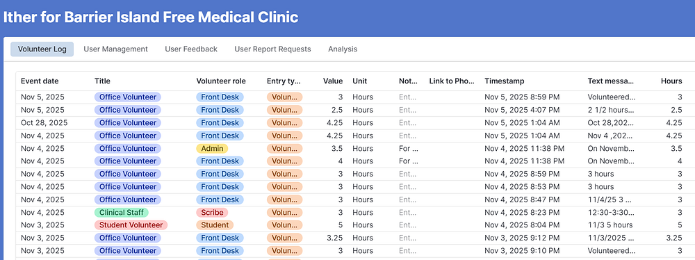
Too often, volunteers are forced to navigate apps, logins and kiosks that are excessive. Data entry should be as easy as sending a text.
The response was overwhelmingly positive. Organizations saw increased retention, and compliance improved. Volunteers appreciated the simplicity, and their feedback was invaluable. By reading every message, I was able to iterate on prompts, fine-tune models, and make design decisions that influenced all my later work.
I also learned some unexpected lessons, a reminder that there is no substitute for real usage when it comes to learning and iterating on a product. When I asked why a volunteer would unnecessarily share their PII (by signing their name at the end of a text), they said they were proud of their work and wanted to put their name to it.
I found that adding randomly selected, simple appreciation phrases felt like real appreciation to the volunteers. The small touch made volunteers feel valued, which is an important reinforcement loop.
The key takeaway: Complex technology has been making people feel frusterated and stupid for decades, with the needs of cirtain populations being totally sidelined in product design. A tool needs to feel not only usable, but easy and enjoyable to use, to have the level of accessability I hope to see in the future of product.
🧠 2. Visually structured text is easier for users to confirm
It is faster to grasp and harder to misinterpret.

Employee Connector was the brainchild of another a startup founder. Their solution provides HR document management, an employee-facing native app, and multichannel outbound communication to employees. Side Nerd extended the functionality to enable 2-way texting: employees add a contact to their phone and ask questions 24/7. The texted response surfaces the most relevant document.
Clarity is so important here. Peoples’ trust in AI answers really varies, and I wouldn’t discourage the skepticism. We can’t have the model share inacurate information, so we present back to the user both 1) a summary of the model’s interpretation of their question and 2) a link to the document. Link rather than answering in-line removes one layer of potential AI hallucination or misinterpretation. (Given some people’s terrible spelling and grammar over text, this isn’t the worst idea).
Generally, Side Nerd uses a hard-coded format to present information back to the user, stating the model’s interpretation of the user’s message and clearly separating intents with visually clear spaces and new lines. This makes it much easier for users to understand, confirm, and correct the information the system has captured.
🔗 3. Integration is empathetic
The best systems respect existing workflows and make the invisible connections underneath.
The next product also came directly from my own experience. When I took a break from coding and started focusing more on sales, I began attending conferences. At first, I thought of course I’d remember every meaningful conversation and every interesting person I met. But the reality was, by the next morning, it was all gone.
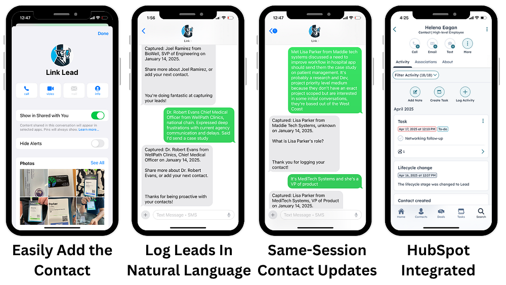
I needed a better way to capture and organize those important interactions. So, I created a system called Link Lead. With Link Lead, you can quickly add a contact to your phone and log details about the people you meet, just by talking naturally and recapping the key points of your conversation. You can also update or add information later, and everything integrates with your existing CRM, whether that’s HubSpot, Salesforce, or another tool.
Integration is empathetic. Nobody wants to add yet another piece of software to their workflow. In fact, when I started, my product was just a Google Sheet, and that was enough for my first customers. For small organizations, anything more is overkill.
Integration works both ways: not just where the data goes and where it comes from, but also how you communicate into the Side Nerd App. We started with text messaging using Twilio, but the architecture was designed to be message channel agnostic, including email, Microsoft Teams, and branded text messages through RCS.
Each messaging channel comes with its own regulations and setup requirements, which can be a hurdle and cause delays when regulators review your system for use. Especially for small and mid-sized businesses that lack tech resources, a fully managed chatbot solution is best for them.
🪴 4. Cross-domain learnings compound product value
Build data architecture that’s transparent, reusable, and improves the model with every real interaction.
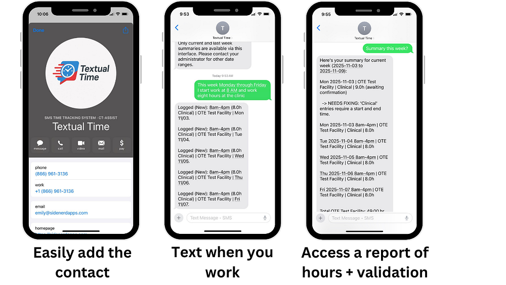
Messaging channel integration is just the tip of the iceburg when it comes to the economies of scale I see when building accross use cases. I built Textual Time in collaboration with a cardiac surgeon staffing agency, CT Assist, who employs many surgeons as W2s, who then serve one or more hospitals. If you think about the software people dread most, time tracking is always at the top of the list. Nobody wants to log into Workday every day.
With Textual Time, you simply add a contact to your phone and text when you’re working or out in the field. You can describe multiple shifts in a single message, and the system uses your phone number to fill in your default details. We’ve added custom features, like letting users request a summary for their pay period, and built-in validation to catch overlapping or incomplete entries. Before anything goes to payroll and hospital billing, users confirm or update their data.
The architecture is built to give users and clients useful and accurate data, but also collect information in a way that improves the speed, flexibility, and accuracy of the models over time, and allows for full transparency if needed.
Whenever I see the model handling a message incorrectly (or even non-optimally), my process from the beginning, was to layer in another 10–50 examples so going forward my model could handle that type of input consistently accross use cases. Periodically, I’d upgrade to a new model, and it’s now a strong model for this specific task. This used to matter a lot more, but it still helps get us from 95% to 99%+.
Getting ready to launch Textual Time, I ran my standard fine tune process and was surprised that the resulting model did not meet OpenAI’s new safety standards. While my old version was grandfathered in, I wasn’t allowed to keep iterating on it, so I had to rebuild my finetune using a newer base model, ensuring compliance with the latest requirements. This is a reality in AI: the technology is advancing rapidly, and what was acceptable a year ago might not be today. It’s hard to justify this kind of model management and oversight work until you hit a certain scale. This piece has it’s own value, and I can offer it as part of a fully managed chatbot solution or as a standalone API product targetted to larger organizations, to reduce overhead, risk, and time to value for natural language -> structured data tasks.

In addition to the shared model, core functionality is standard across different industries, so we’re leveraging proven design decisions from one use case to enhance another.
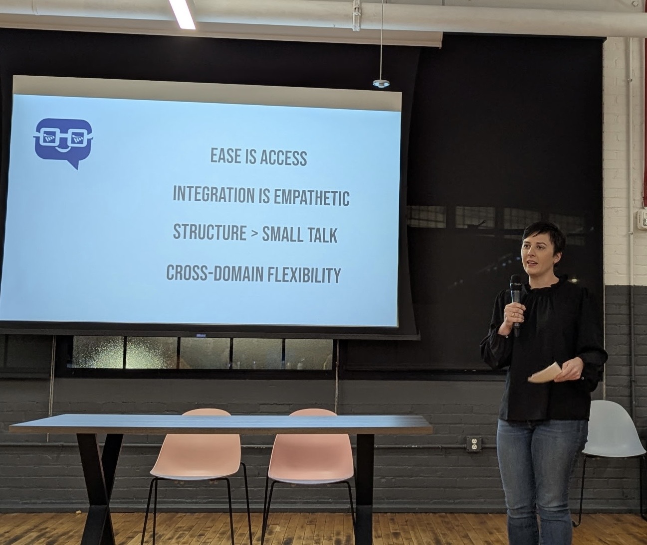
Ultimately, the future is text-first, AI-first interfaces, tools you can access via any message channel you already use. My design tenets are simple: Ease is access. Integration is empathetic. Consistently structured text is easier and faster for a user to understand than conversational text (structure > small talk). By focusing on cross-domain flexibility, we go further than single-use chatbots, and pave the way for businesses of all sizes and levels of tech maturity to provide accessable tools, that don’t even feel like software at all.

.jpg)
